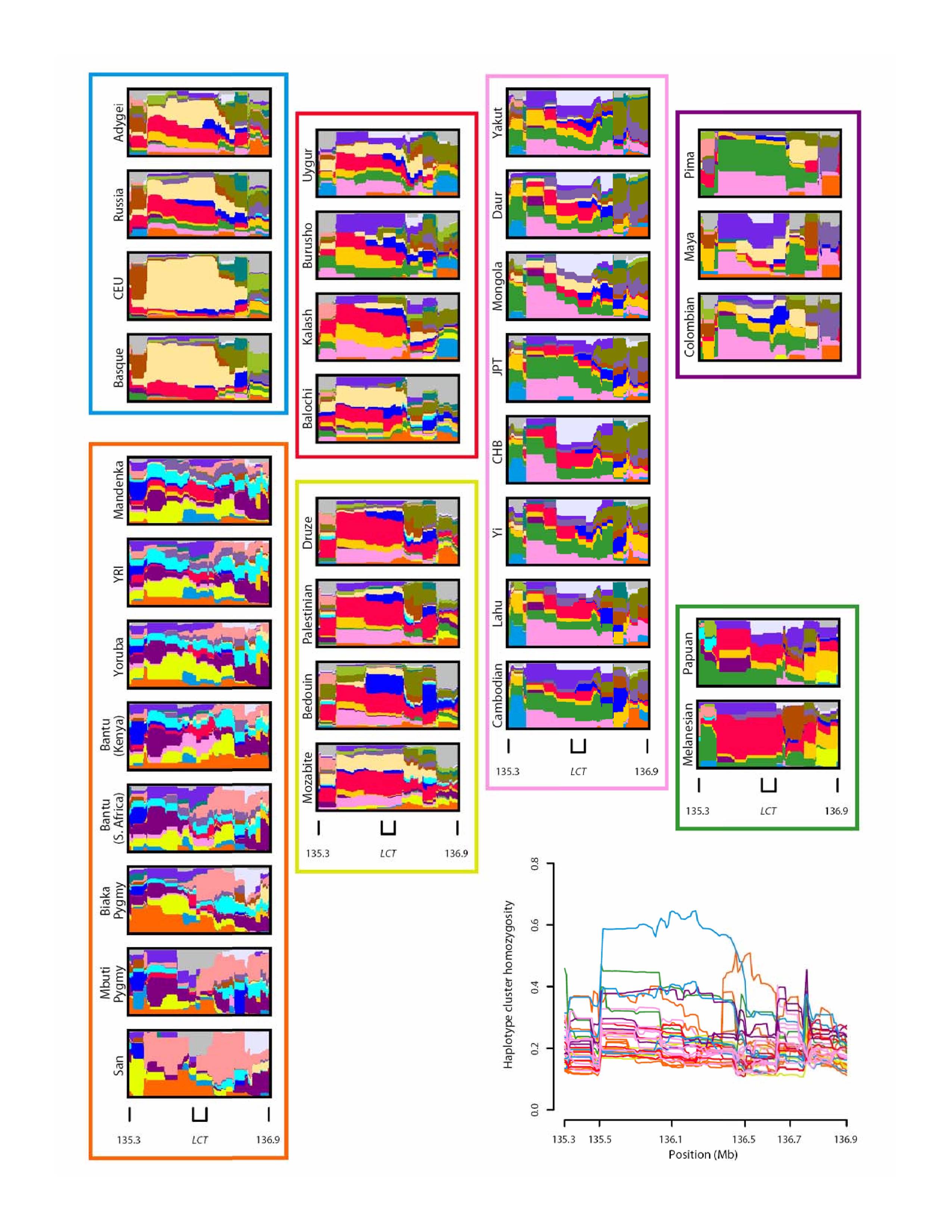
ABOUT THIS IMAGE. HAPLOSCOPE plot of variation in the
lactase region of the human genome.
At each genomic location, relative frequencies of haplotype
clusters are shown on a thin vertical line. Each color depicts a
haplotype cluster, and the proportion of a line in a color gives the
frequency of the cluster associated with the color. The long
high-frequency cluster in European populations, quantified by the plot
of haplotype cluster homozygosity at the lower right corner, reflects
a selective sweep in the lactase region. The figure is based on the
work of Jakobsson, Scholz, Scheet, et al. (Genotype, haplotype and
copy-number variation in worldwide human populations; Nature
451: 998-1003, 2008).
[Image gallery 1 | 2 | 3 | 4
| 5 | 6 | 7 |
8 |
9 | 10 ]


