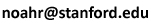
ABOUT THIS IMAGE. This image shows the variance of the level of
admixture from a source group among individuals in an admixed
population, in the temporal limit.
In each of the four panels, the x-axis gives the fraction of females
entering the admixed population from the source in each generation, and
the y-axis gives the corresponding fraction of males. The shading
represents the variance — greatest when the male
and female contributions are equal. The four panels represent different
scenarios for the level of contribution of the admixed population to
itself in each generation (upper left: no contribution of the admixed
population to itself; upper right: 25% of female ancestry is from the
admixed population; lower left: 25% of male ancestry is from the admixed
population; lower right: 25% of female ancestry and 25% of male ancestry
are from the admixed population). The figure is based on the work of
Goldberg, Verdu & Rosenberg
(Autosomal admixture levels are
informative about sex bias in admixed populations; Genetics
198: 1209-1229, 2014).
[Image gallery 1 |
2 | 3 | 4 |
5 | 6 | 7 |
8 |
9 | 10 ]